About the CI
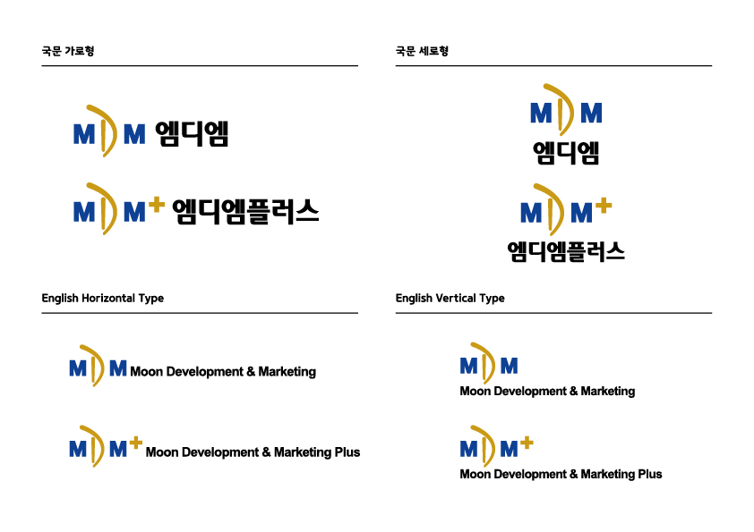
The shape of the symbol mark was inspired by the initials of “Moon Development & Marketing.”
Meanwhile, the “D” from “Developer” emphasizes MDM Group’s identity as a real estate developer.
The overall design represents the stable image of the group,
and simultaneously works as an exclamation mark (!) symbolizes
the concept of development (D) in a more dynamic way.
Ultimately, the CI showcases the progressive and future-oriented nature of the MDM Group.
#Enterprising #Stable #Reliable #Dynamic #Creative #Future-oriented
Signature
Color System
that aspires to be a reliable partner and pursues higher values.
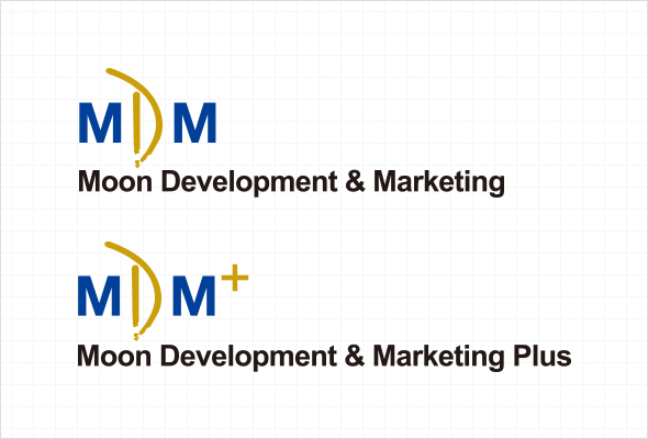
MDM, which aims to become the industry's no. 1 global comprehensive real estate group,
creates a stable and reliable image for the group using the color blue,
while showing its more progressive side and its capacity to produce results
with the higher values, it pursues using the color gold.
-
MDM DEEP BLUE
RGB11 / 77 / 162
CMYK94 / 75 / 8 / 0
-
MDM GOLD
RGB197 / 153 / 49
CMYK30 / 44 / 89 / 0